When comparing different classification methods, the most frequent used metrics are accuracy, error rate and for visual representation, ROC curve. However when working on an imbalanced dataset, this metrics can be very deceiving. In this post we will look at what a ROC curve are, the problems with using this on imalanced data, and method that can substitue the need for Receiver Operating Characteristics curve (ROC curve).
What is a ROC curve
A ROC cuve helps us get a better visualization on the trade-offs between the benefits and costs of classification regardingthe data distribution. A ROC curve use the metrics true positive rate (tpr) and false positive rate (fpr) to create the graph. They are, mathematically, defined as:
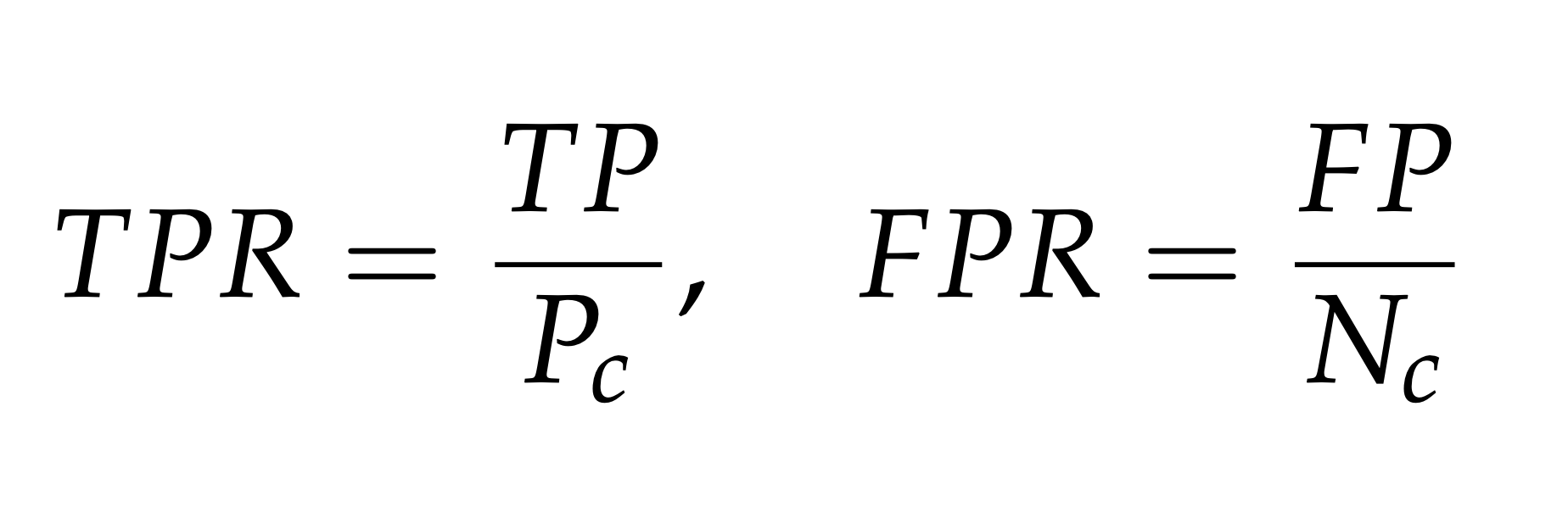
Where TP and FP are the number of true positives and false positive respectively, Pc and Nc are
the number of true positives and true negatives respectively. Below is an example of the graph when plotting this two variables against each other.
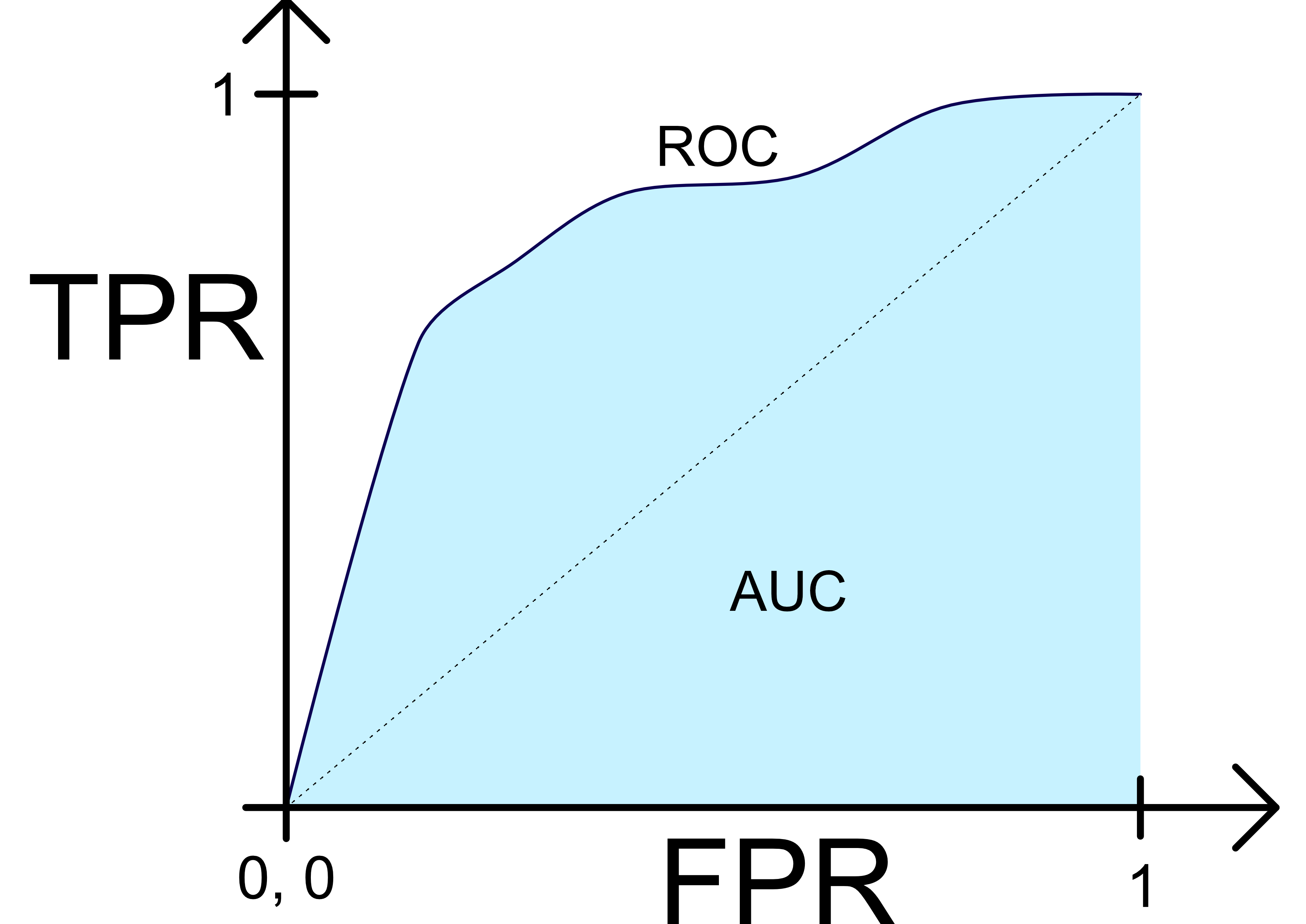 An ideal characteristics for a plotted classification is when the curve first go up to 1 on the y-axis then to 1 on the x-axis. This implies that the curve in the example figure is very close to an optimal ROC curve. And generally speaking, a classifier is
better than another, if its points are closer to the upper left corner compared to the other. The dotted line in the figure represent no learning. If a classifier has points below the dotted line,
its performance is worse than random guessing. If this is the case a fix may be to invert the guesses from the classifiers.
An ideal characteristics for a plotted classification is when the curve first go up to 1 on the y-axis then to 1 on the x-axis. This implies that the curve in the example figure is very close to an optimal ROC curve. And generally speaking, a classifier is
better than another, if its points are closer to the upper left corner compared to the other. The dotted line in the figure represent no learning. If a classifier has points below the dotted line,
its performance is worse than random guessing. If this is the case a fix may be to invert the guesses from the classifiers.
Calculatuing the area under the ROC curve, (areal under curve AUC), can be very useful to get an indication on how well a method is perfoming. The value is viewed as a percentage of how much areal the ROC curve covers. Higher percentage impies a better curve. This metric can indicate how well a classifier are doing. Though it is possible for a classifier with lower AUC to perform much better in certain regions than a classifier with higher AUC. So be sure to look at the curve as well when comparing classifiers.
Problems with imbalanced data
It may seem that getting a high accuracy is very easy when working on a imbalanced dataset, but if we analyse the
results, the reason often is that the classifier have learned to only predict the majority class. And when the majority
class has 90+% of the samples, is not an accuracy of 90+% very impressive. So we need a method that can evaluate on other premises, such as a ROC
curve. Since this method uses FPR and TPR, the visualization of the result will now be more dependent on the data distribution, though there is still some
problems evaluating with a ROC curve. In the figure below, four classifieres are plotted against each other in a
ROC curve after being trained on a imbalanced dataset:
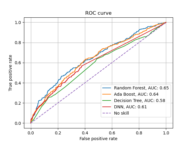 As we can see is AdaBoost and Random Forest competing in different sections on being the best, and Decision Tree is only doing a little bit better than random guessing. Looking at the curve we get the feeling that some classifiers are performing
better than other, though none of them are doing particullary well. So what are the problems when using a ROC curve to evaluate imbalanced data:
As we can see is AdaBoost and Random Forest competing in different sections on being the best, and Decision Tree is only doing a little bit better than random guessing. Looking at the curve we get the feeling that some classifiers are performing
better than other, though none of them are doing particullary well. So what are the problems when using a ROC curve to evaluate imbalanced data:
- When there is a really high imbalance, the ROC curve can be too optimistic.
- If Nc > Pc and the classifier classifies a large amount of samples false positives, changes in the FPR rate will be minimal, which implies that it will not be shown in the ROC curve.
- The ROC curves are unable to derive the statistical significance of different classifiers performance.
- The ROC curves have difficulty of providing insight on a classifiers performance over varying class probabilities or misclassification costs.
Solving the problems with a PR curve
The problems with the ROC curves can be solved with using a Precision Recall curve (PR curve). This post is not going to go in depth on the PR curve, simplified it is plotting precision against recall. Where precision is how many labels are predicted correctly of all positive samples and recall are how many of the positive class were labeled correctly.
The reasons PR curves are a better option when working on imbalanced data is that:
- Can capture the performance of the classifiers when the number of false positives changes.
- Can capture all the benefits from the ROC space, since its curves has the same properties like the convex hull in ROC space.
Conclusion
In this post we have derieved at what a ROC curve are, how it is ued in evaluation and what problems it face when used on imbalanced data. In the end another method, the PR curve, has been presented as a substitute for evaluating with a ROC curve.
Sources and further reading
- J. Davis and M. Goadrich. The Relationship Between Precision-Recall and ROC Curves. 2006.
- T.C.W Landgrebe and P. Paclik and R.P.W Duin. Precision-recall operating characteristic (P-ROC) curves in imprecise environments. 2006
- H. He and E. Garcia. Learning from imbalanced data. 2009.